Overview
about ongo
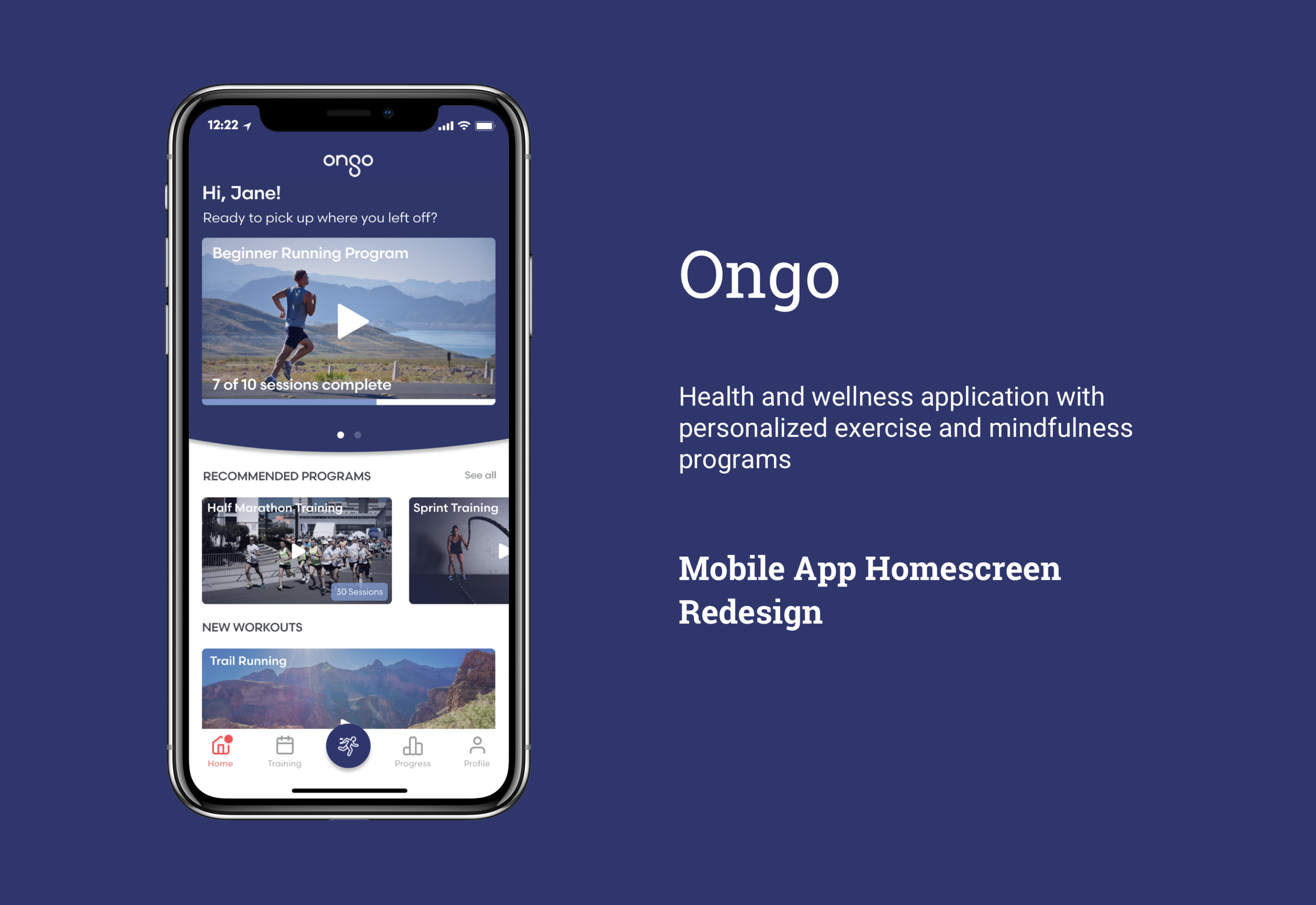
Ongo is a health and wellness application that provides users with science-backed exercise and mindfulness programs curated by influencers. While in beta, Ongo approached us to redesign their mobile app’s homescreen so that it would be more visually appealing and user friendly, and provide enough information to clarify Ongo’s role in improving users’ health and wellness.
my role
I worked on this project end to end, focusing on research, UX, and UI. My primary objective was to understand the needs of potential users and Ongo’s growth trajectory, and design an interface that reflected both in order to communicate Ongo’s UVP and make it easy for users to navigate core functions.
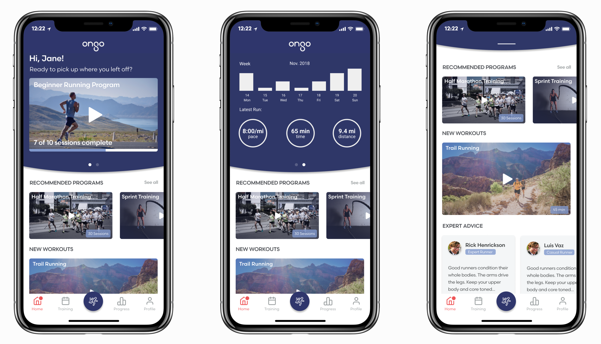
A Few Final Screens
Research
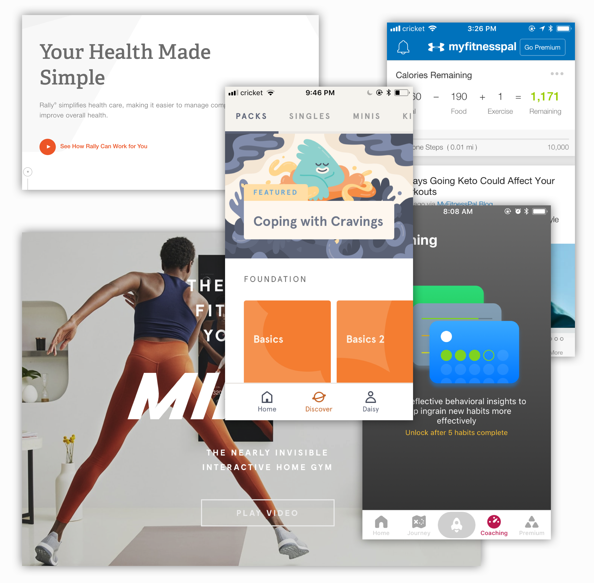
competitive analysis
Desktop research and competitive analysis helped us to better understand the health and wellness space. Evaluating potential competitors for Ongo showed us what features were popular among current fitness solutions, and informed our subsequent user surveys.
User Surveys
We surveyed and interviewed over 25 users who exercised or participated in mindfulness activities regularly. Most participants identified their fitness level as intermediate or advanced and, on average, worked out 3-4 times per week.
Synthesis
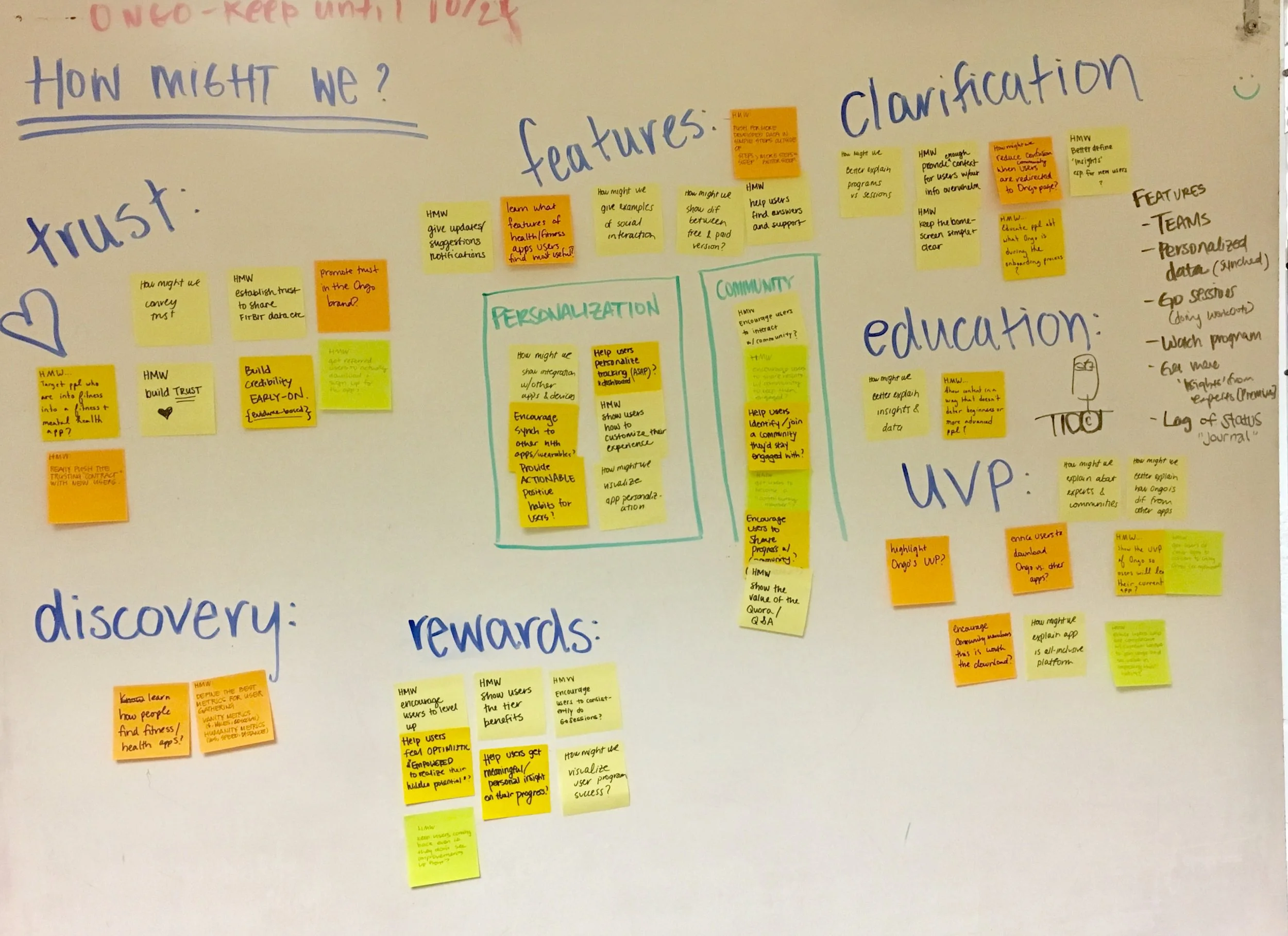
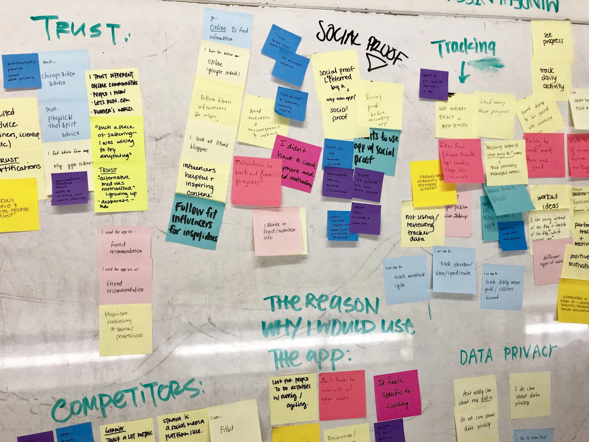
We synthesized our research and survey data using Affinity Mapping and How Might We frameworks. These tools allowed us to group and analyze user needs at a high-level, and get a better picture of who our users are (and what they’re looking for in a fitness app).
Key Findings
While their activities ranged, most users’ fitness goals were related to one or more of the following categories:
Functional Fitness
Maintain current fitness level
Level-up
Weight loss
Training for a specific event
Furthermore, participants who already incorporated fitness apps in their training listed the following reasons for use:
Ability to track their data and progress
Ability to track their food intake/calories
Being encouraged and/or challenged to do more
Design
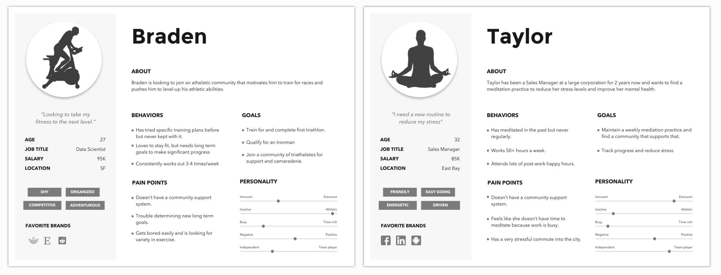
Provisional Personas
From our research, we aggregated our key user insights to create provisional personas that would act as a foundation for design. The initial explorations of our homescreen interface were guided by and based on the needs of these two personas.
feature prioritization
In order to grow their platform, Ongo needed more people using their platform. And to get more people on their platform, Ongo needed to get new users to start (and return to) training programs. Given that the majority of new users would not be experienced athletes experienced with deep knowledge of physical training programs, we wanted to determine what kinds of programming new users would take advantage of and what kinds of features would be most valuable to them, in order to increase retention.
From our research findings, we determined that users most valued being able to identify and follow specific workout Programs, access and review their own Progress (in specific programs, and in aggregate), and track and study their activity Statistics to see how they have been performing over time.
In order to design for our target user group, we prioritized Programs, Progress, and Statistics in our content hierarchy.
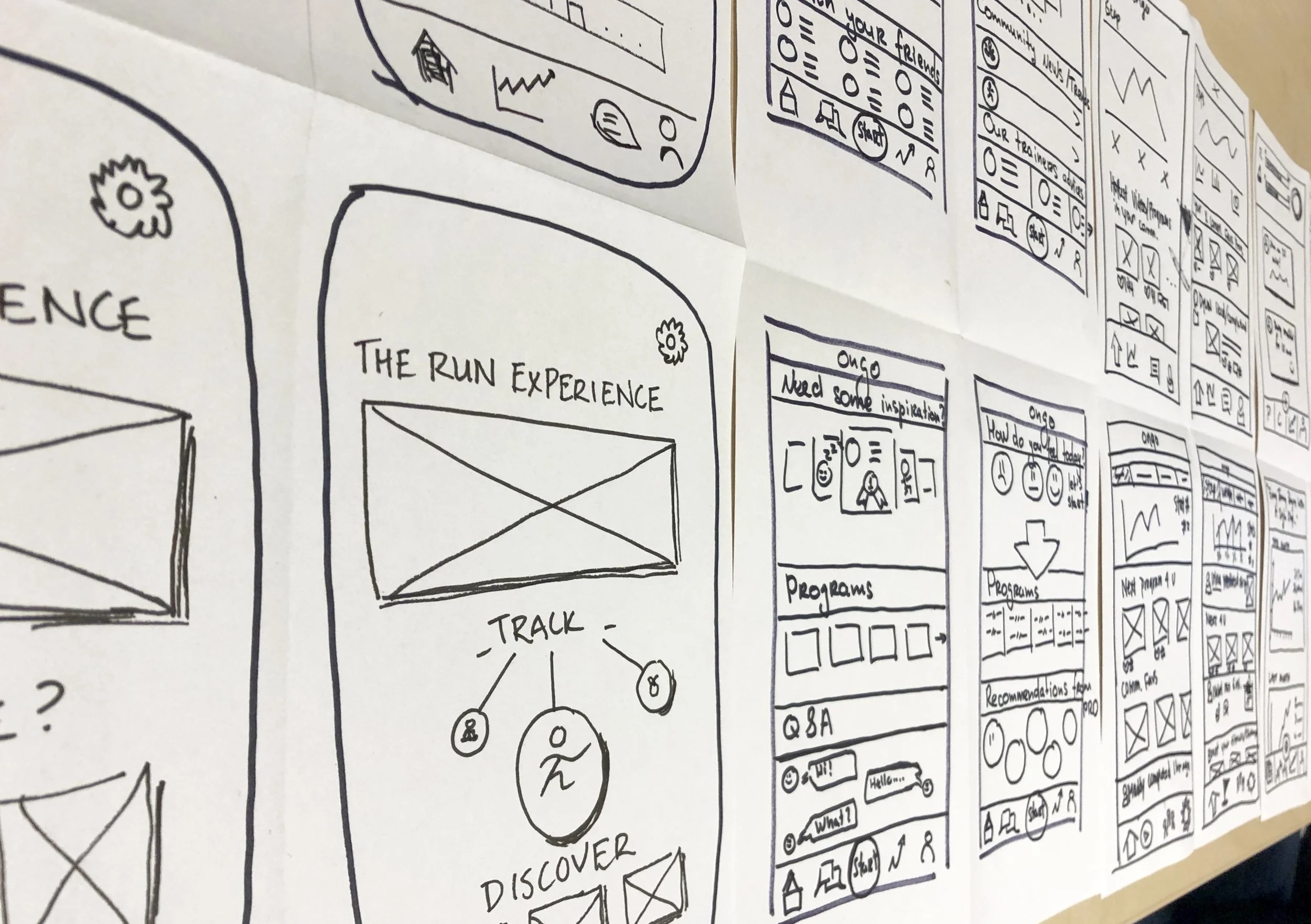
UI Sketches
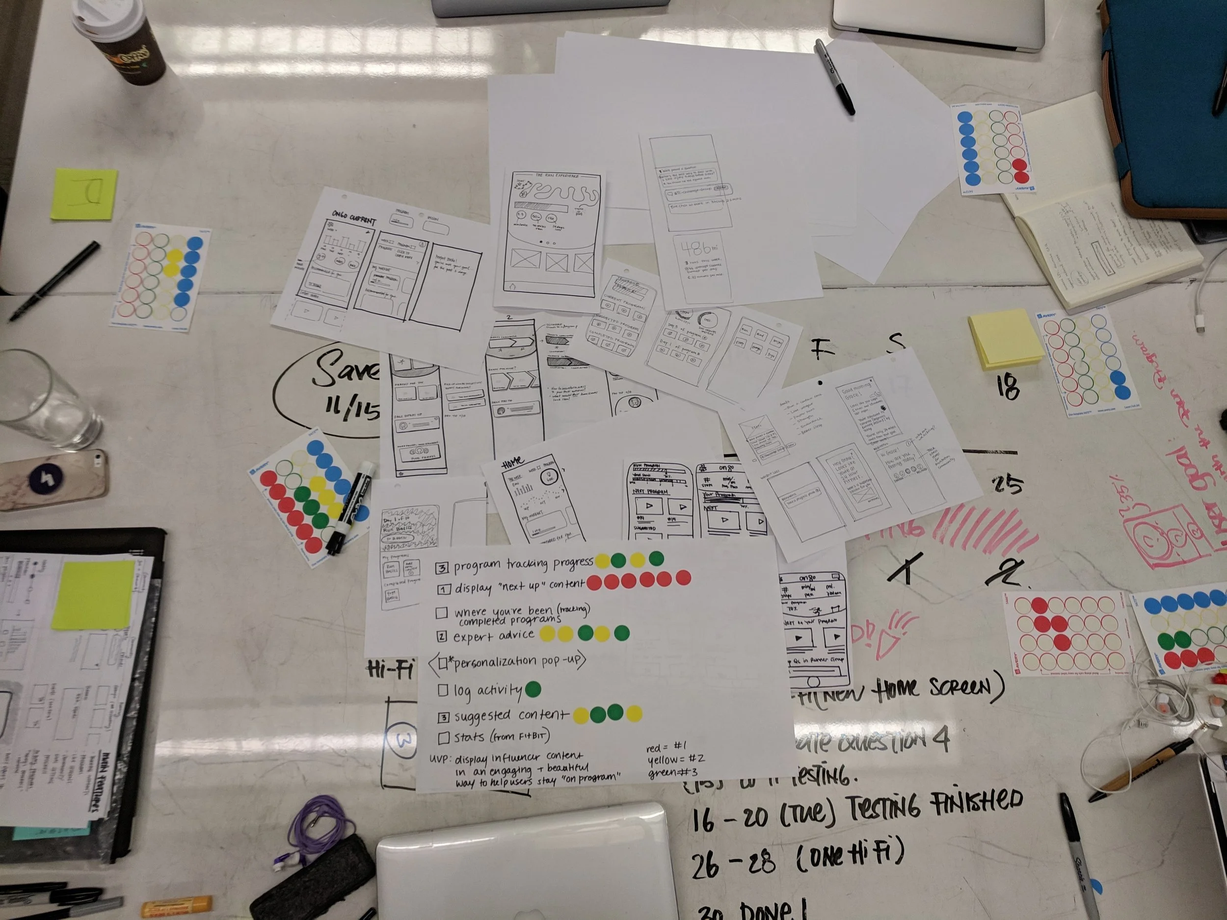
As a team, we ideated on various homescreen layouts which incorporated our three key content categories, then dot-voted to converge on a set of layouts to wireframe.
wireframes
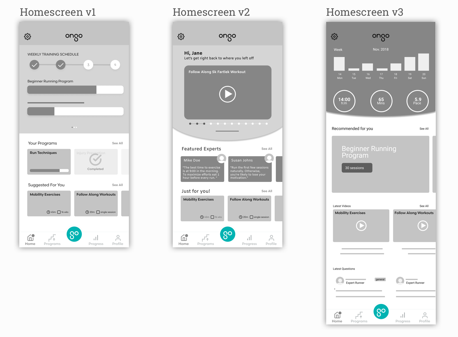
We turned our UI Sketches into Lo-fi Wireframes to add more visual structure to our content hierarchy and prepare options for user testing.
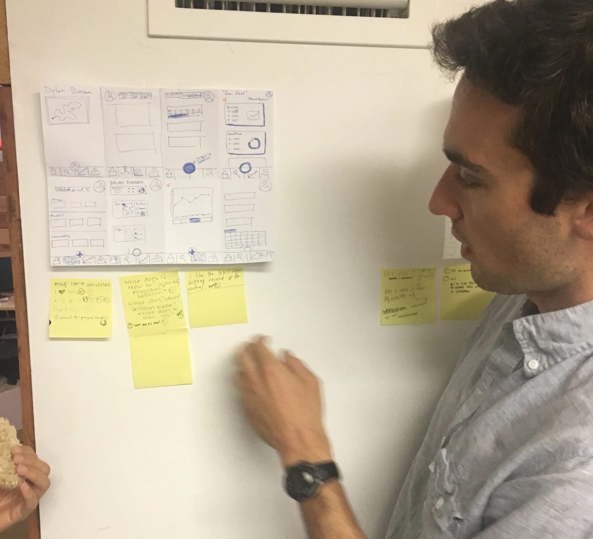
usability testing
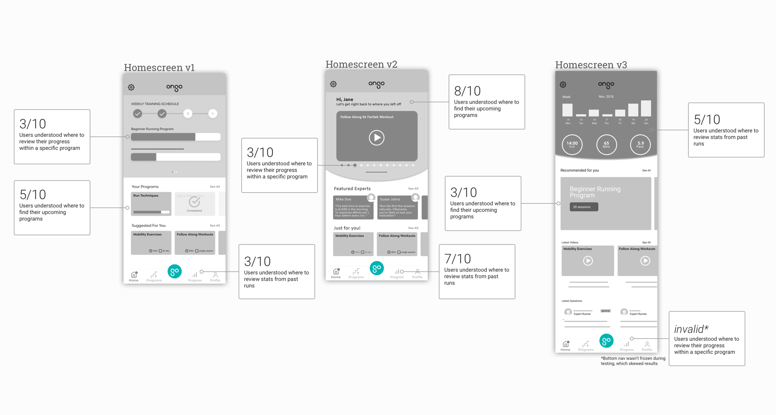
We then tested our different homescreens with 10 users to assess comprehension and usability of the interface and content. Our goal was to evaluate whether our content was content the users expected and wanted to see, and whether the interface was intuitive and enjoyable to use. Quantitative results below:
qualitative results & synthesis
After synthesizing usability data (task completion rates, presented above) with feedback from the same users, we identified key insights about the usability of our homescreens.
Program Progress: All options failed to effectively communicate to users where to review progress within a specific exercise or mindfulness program
Stats vs. Progress: Users were confused about how to access aggregate statistics from all historical activities, and weren’t clear on how that might be different from reviewing progress within an exercise or mindfulness program with a set number of guided sessions
Upcoming Sessions: Without explicit wording, most users didn’t know where to find the next session of a program in which they were currently participating
These insights informed the design of subsequent iterations, described below.
iterations
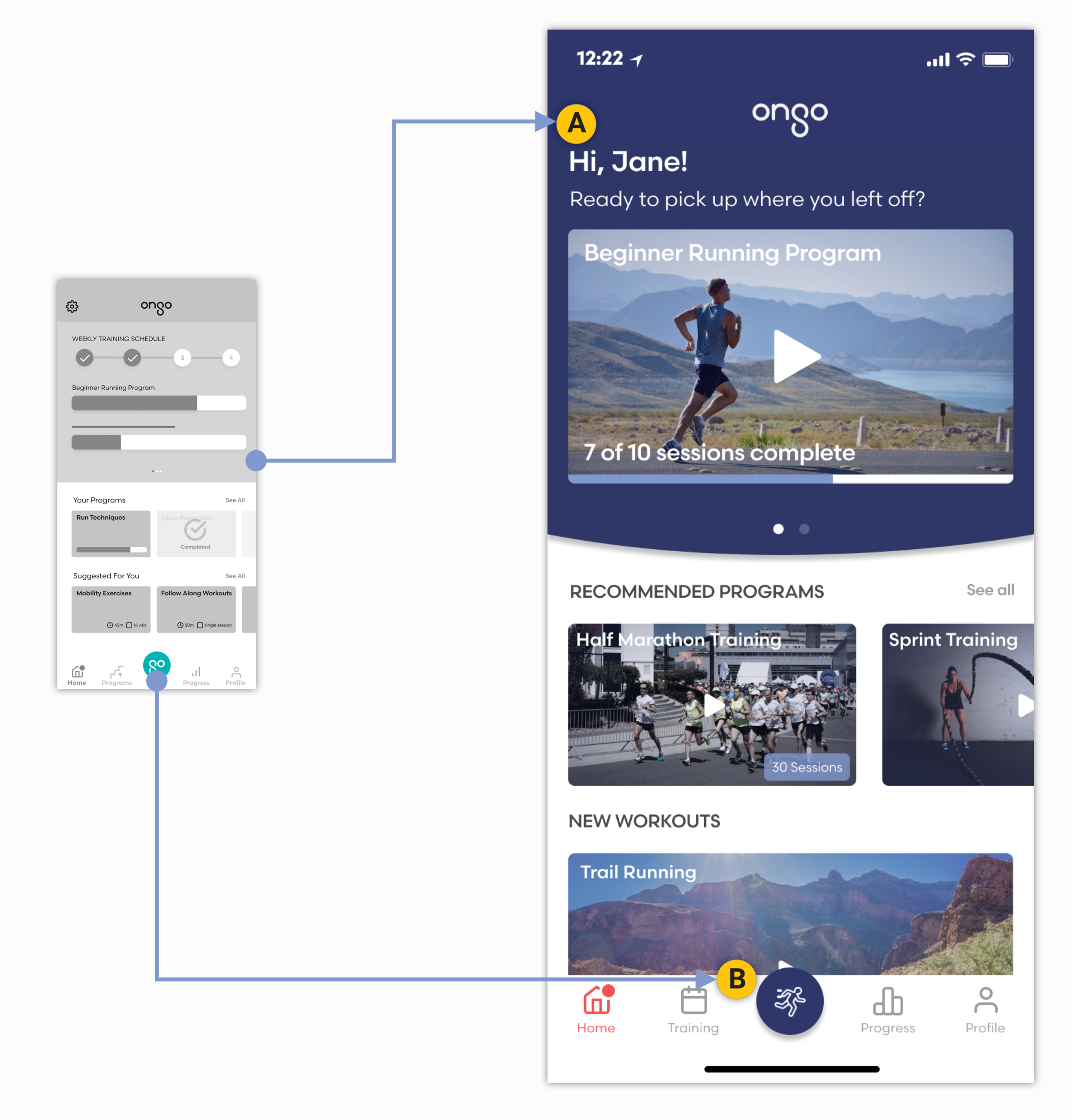
A. Priority Program: The next session in users’ current program is featured front and center, and progress within that program is also visible
B. Action Button: The ‘go’ button is replaced with runner image to clarify action; clicking on the button starts an activity recording separate from any structured program
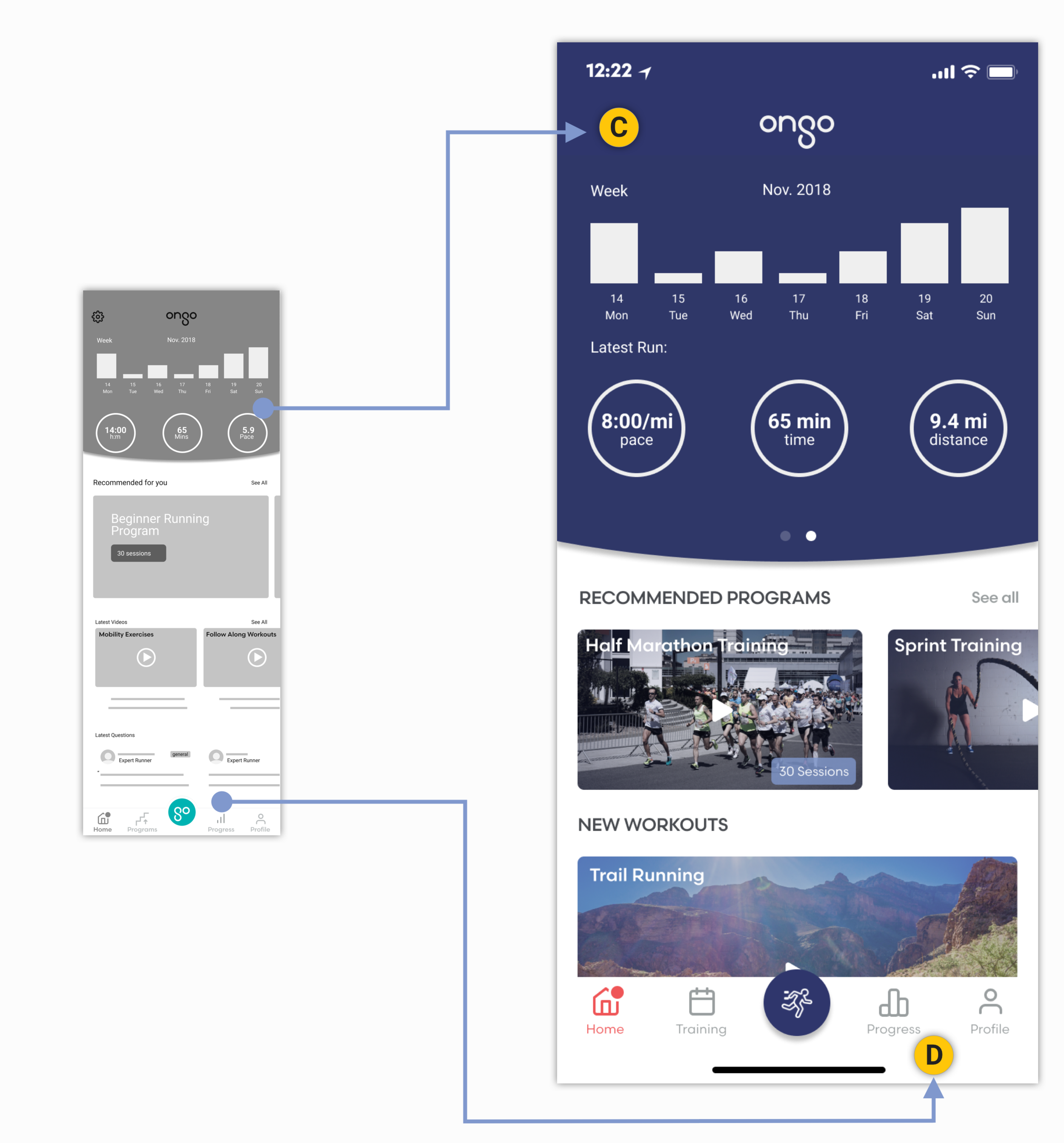
C. Recent Personal Stats: Weekly statistics as well as detailed information on the most recent activity are included on the second tab or the top card
D. Aggregate Personal Stats: Aggregate stats from all of users’ past activities—including from structured programs—can be accessed via the bottom navigation bar
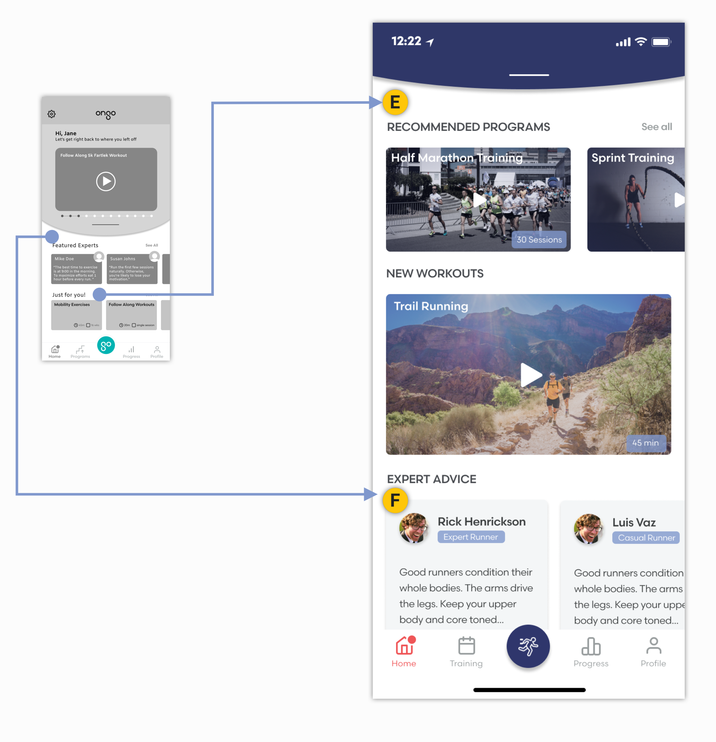
E. Content Clarification: A distinct set of cards displays suggestions for future programs that Ongo thinks users may enjoy. These are separate from programs users are currently participating in
F. Content Hierarchy: The ‘Expert Advice’ section is de-prioritized and now lives below the fold, reflecting split reactions among users on how frequently they thought they would access the feature
In Closing
Next Steps
Reflection
With our redesign completed, we recommended to the Ongo team that they use our homescreen designs for further A/B testing. As Ongo adds verticals and incorporates other user segments, they should continue to evolve their feature set to reflect the diversity of user types on their platform.
Given the range of features the Ongo founders were excited about implementing, and the existence of many other fitness applications on the market, this was a great opportunity to refine and communicate the Ongo’s UVP and prioritize core features by learning from and testing with users.

