Overview
about clerkie
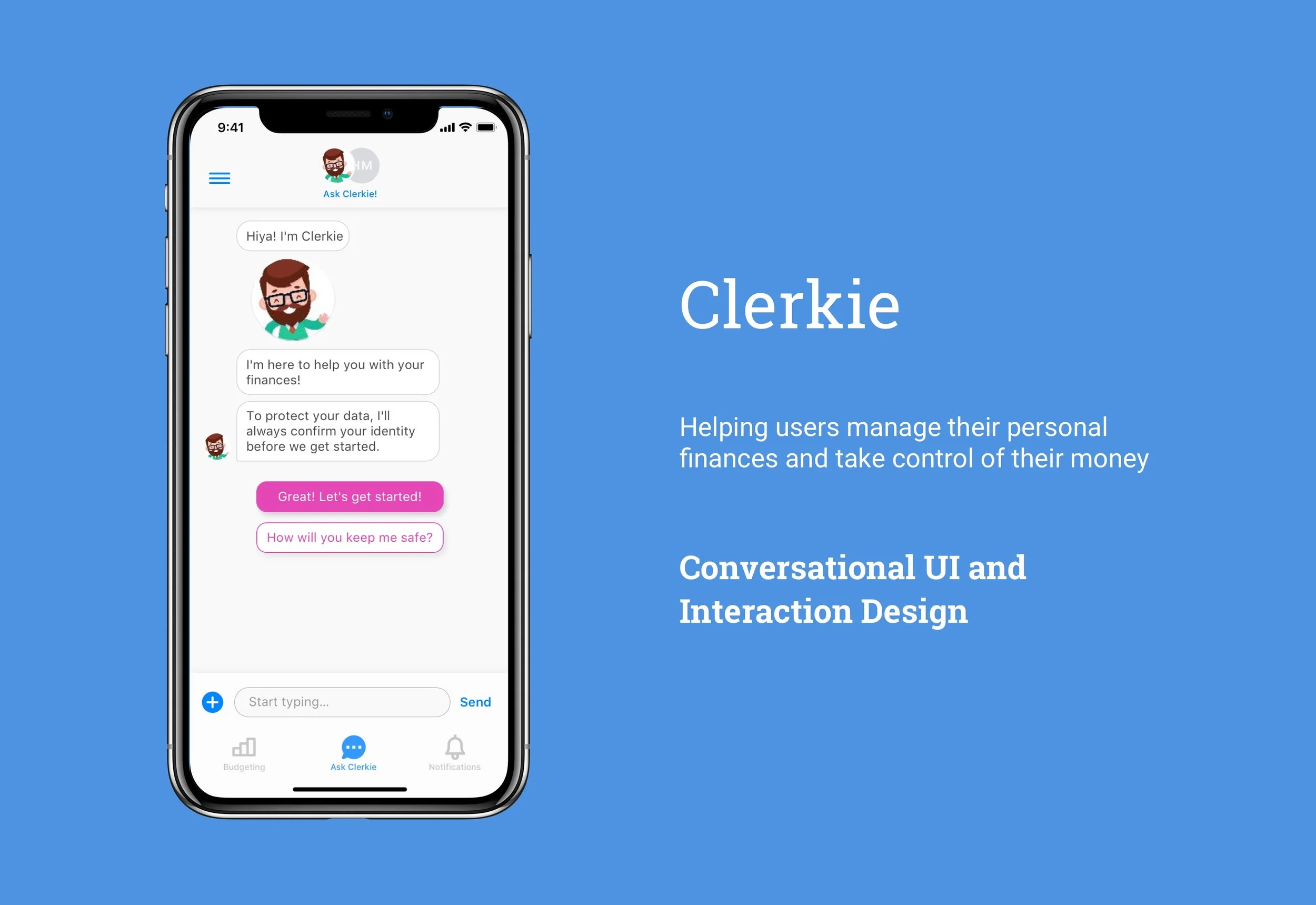
Clerkie is a personal financial assistant for everyone. Their chatbot helps users improve their financial health through holistic management of all aspects of personal finance. Clerkie approached us to redesign core onboarding, budgeting, and financial product comparison flows in order to improve the overall experience of managing finances on mobile and to combine chatbot UI with traditional mobile UI.
my role
As the lead product designer, I managed a team in designing the iOS app, and worked directly with the Founder at Clerkie. My responsibilities included defining project scope, methods, and goals based on both business and user needs, communicating directly with the founder, and leading brainstorming sessions and weekly design sprints.
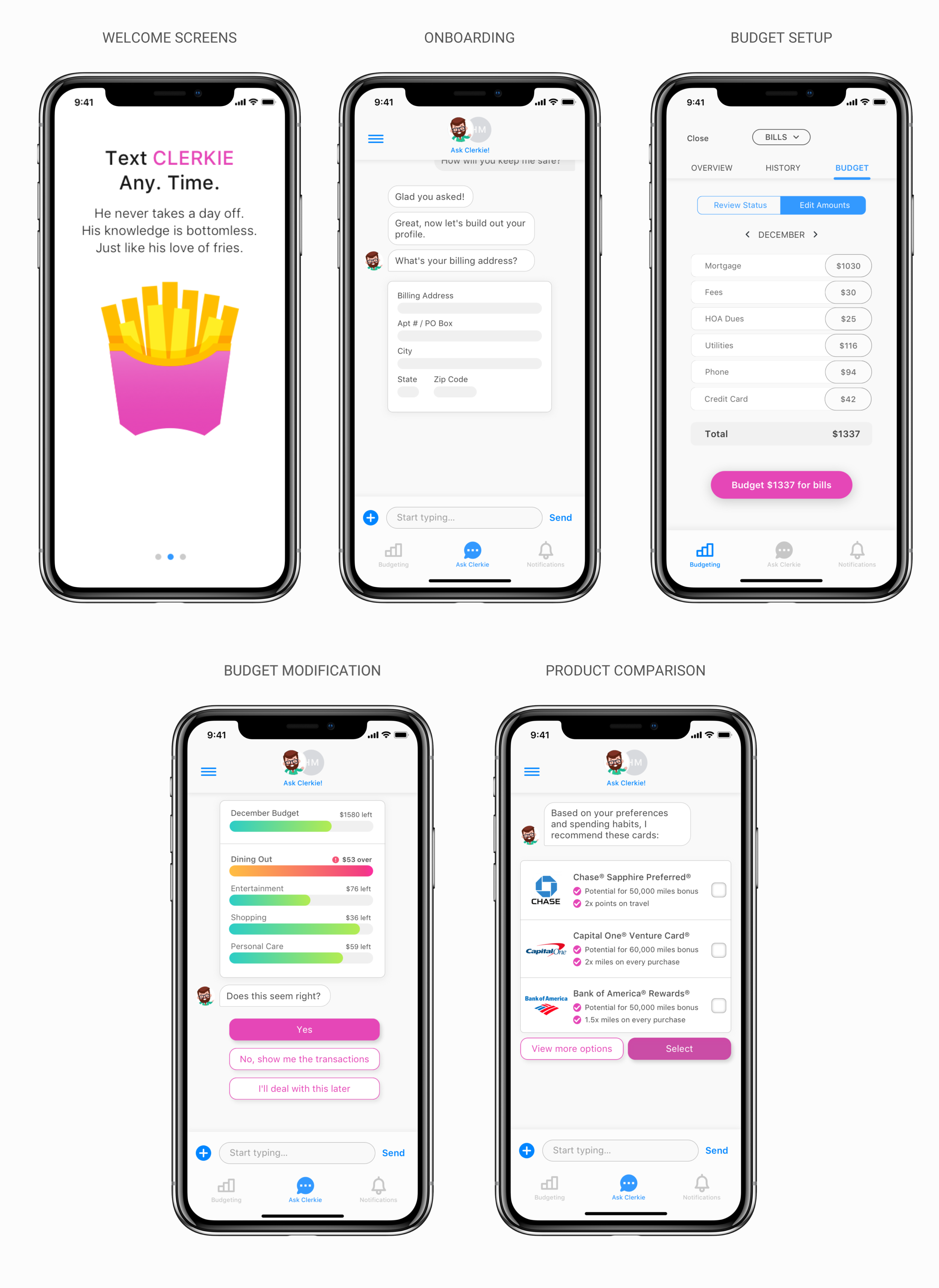
A Few Final Screens
Research
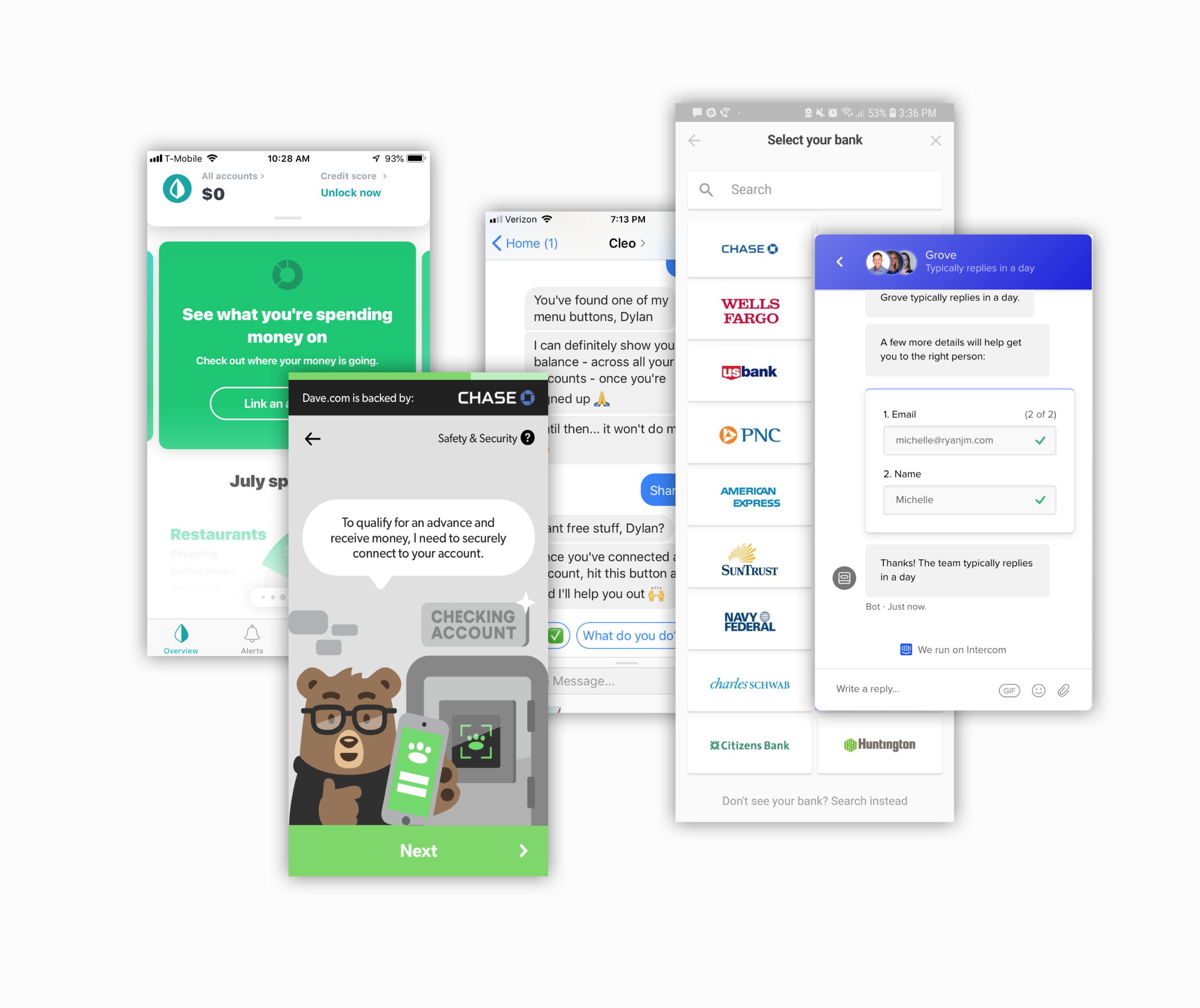
Competitor & Comparator Analysis
In order to gain insight on how to solve Clerkie’s challenges, we researched direct competitors in the personal financial management space as well as comparative application using chatbots to interact with users. Specifically, we wanted to understand:
How do mobile apps represent complex financial tasks with limited screen real estate?
How do these apps demonstrate value to users while requiring the input of sensitive data?
How do chatbots emphasize and demonstrate security to users?
What tasks do users want to ‘outsource’ to finance apps, and what tasks do they want to retain control of?
User Survey & synthesis
We also sent around a survey to over 130 users asking them about aspect of their personal finances: how they currently manage them, what their needs are, what pain points they have, and how they would like to manage their finances in an ideal state. Some key takeaways from our user survey included:
Chatbots
For users who have interacted with chatbots, the most commonly reported characteristics of a positive chatbot experience were: (1) fast & efficient; (2) informative; (3) humanlike
Ideal Financial Advisor
If given the opportunity to sit down with the world’s best financial advisor, users most commonly responded that they would ask about (1) budgeting, (2) getting out of debt, and (3) investing
Financial Management
Respondents turn to trusted family members or close friends for financial advice as frequently as they turn to ‘expert’ online tools or resources
There was no clear winner in the finance app space; the most popular, Mint, was listed by only 10% of users
Mobile app users valued simplicity and easy of use above all other features
Design & Prototype
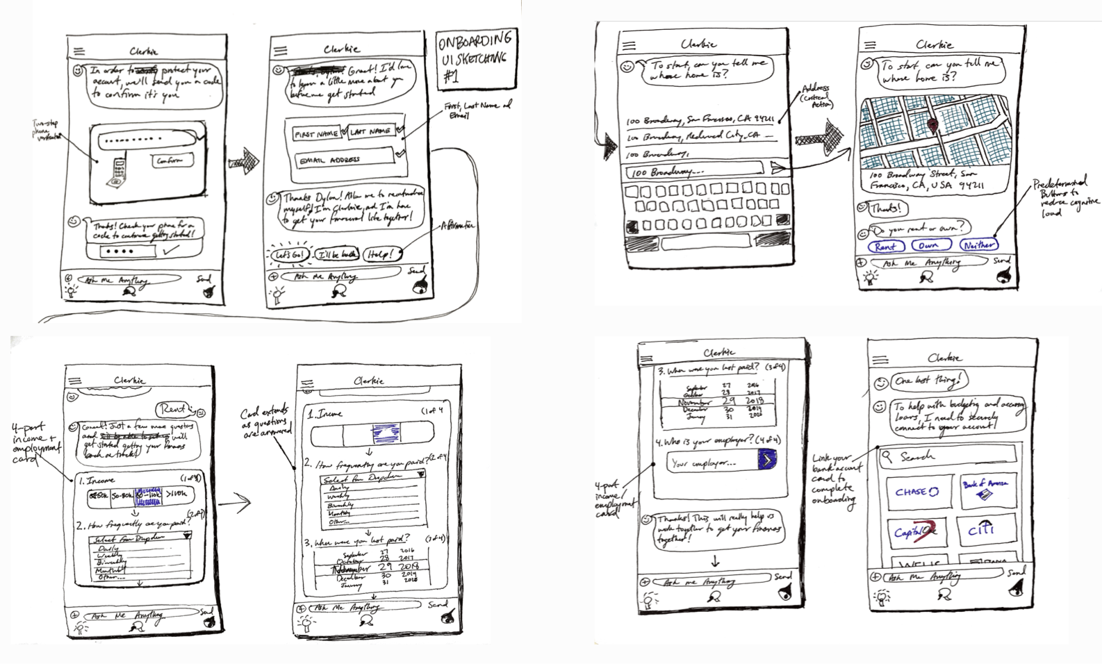
ui sketching
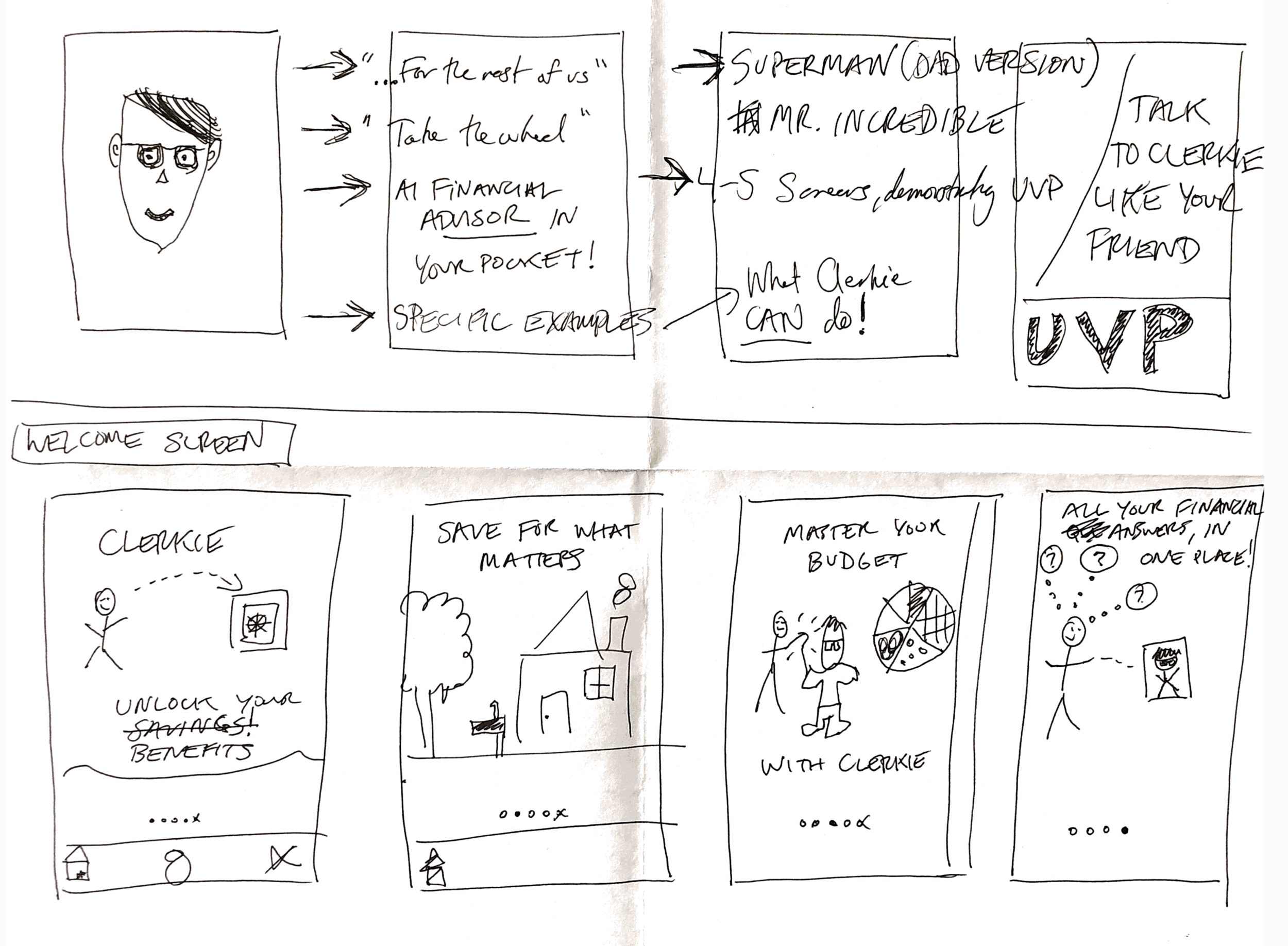
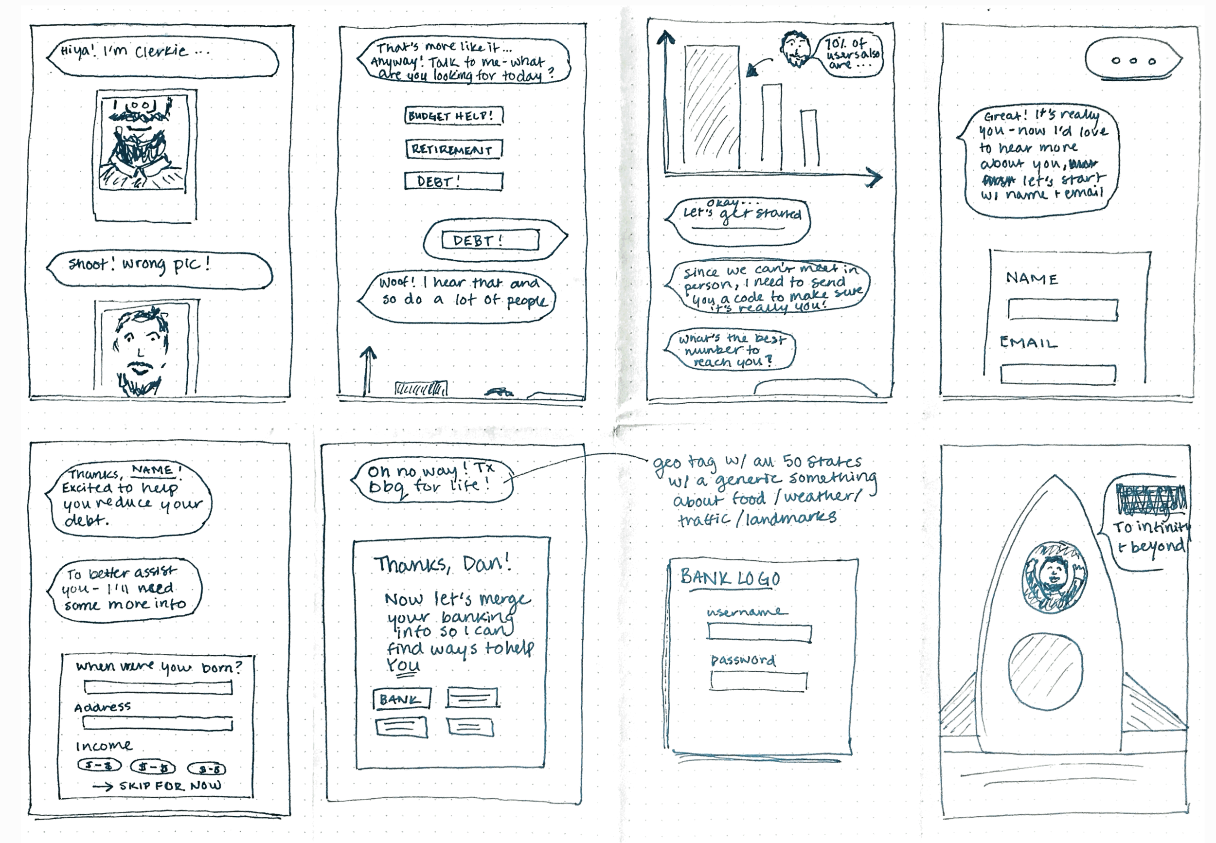
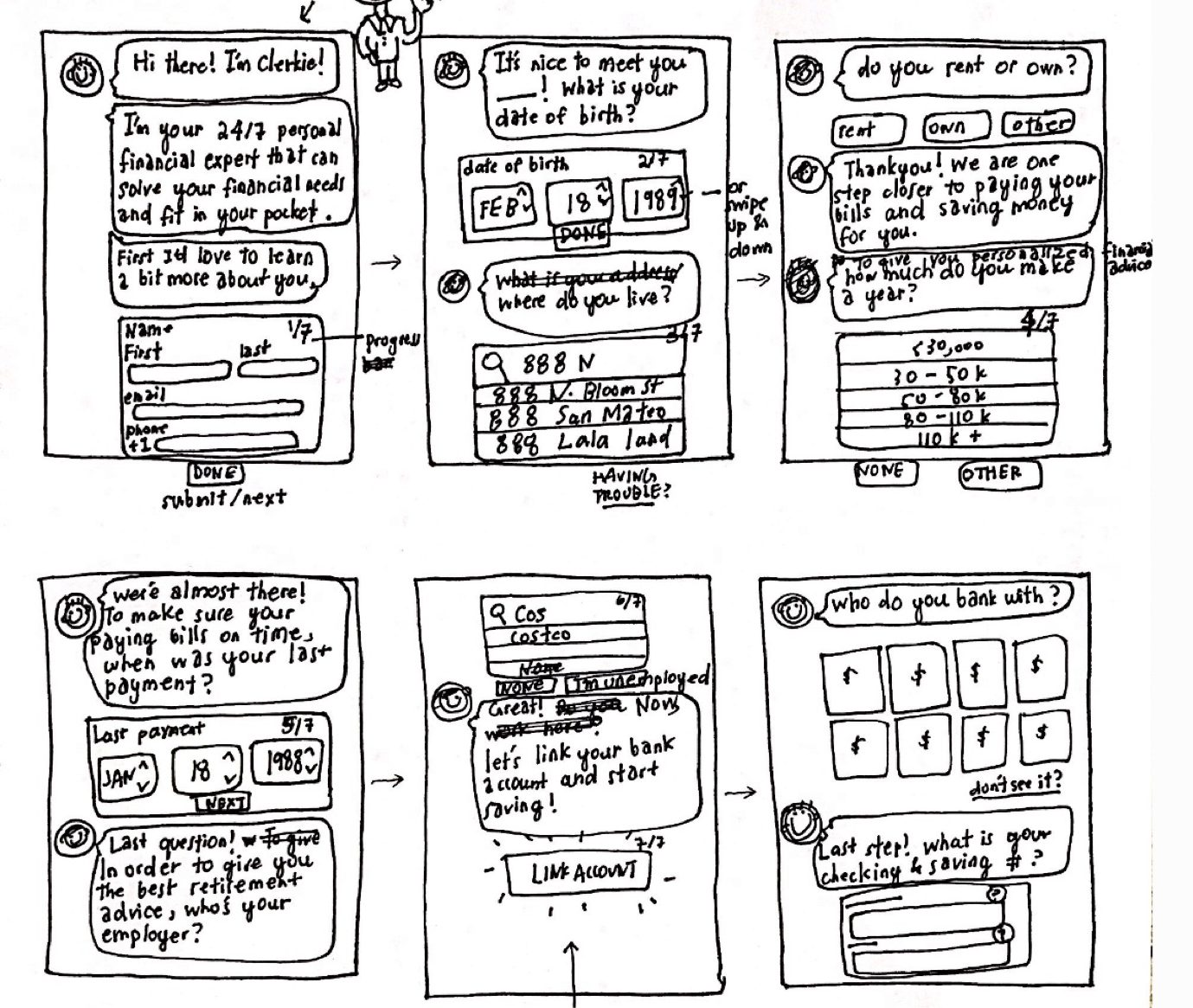
Based on research findings, the team sketched concepts and flows for various features of the app. As we delved deeper into user flows, we also brainstormed different elements of Clerkie’s personality.
Lo-fi Wireframes
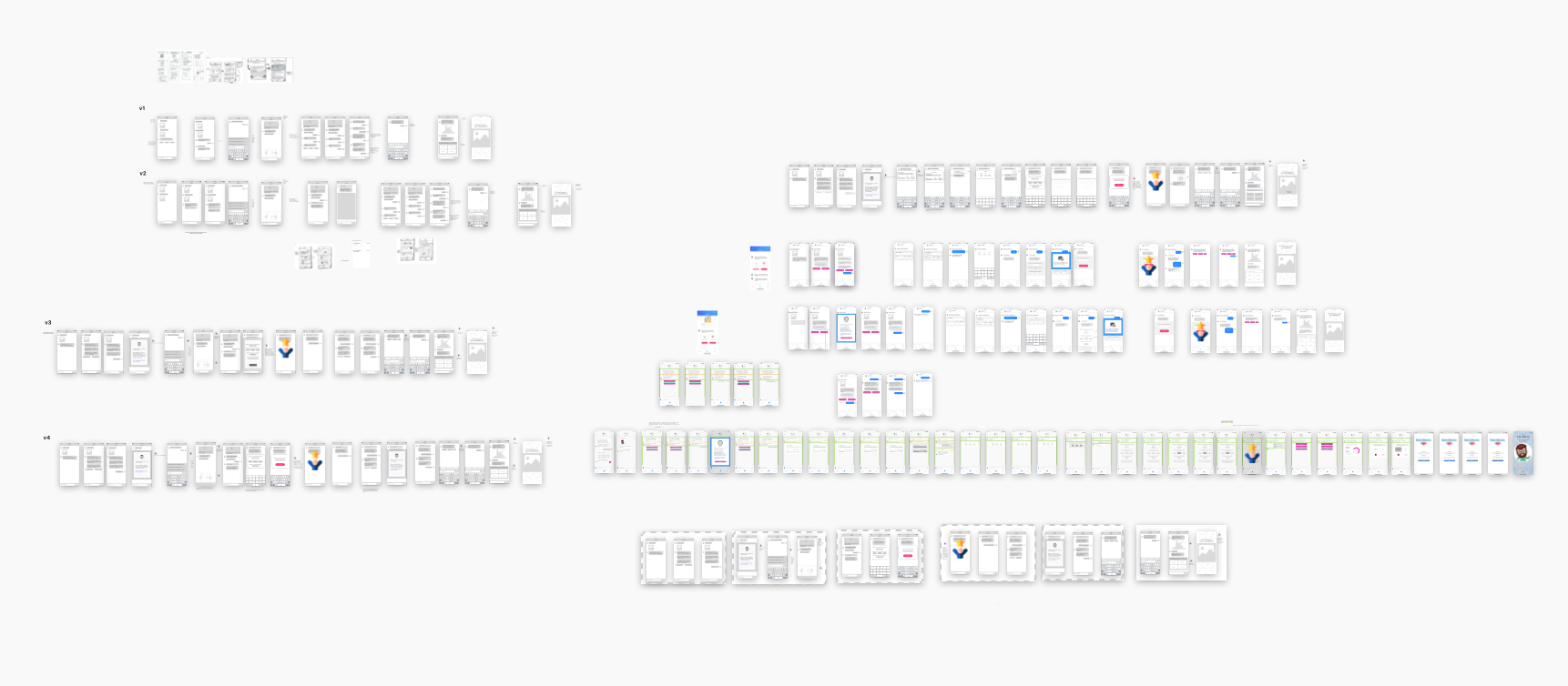
After our physical sketching, we converted some of the best designs into wireframes and continued to explore new ideas. Over the course of lo-fi, the team generated a lot of different concepts, UI layouts, and content. The winning wireframes were refined for validation testing
voice & tone
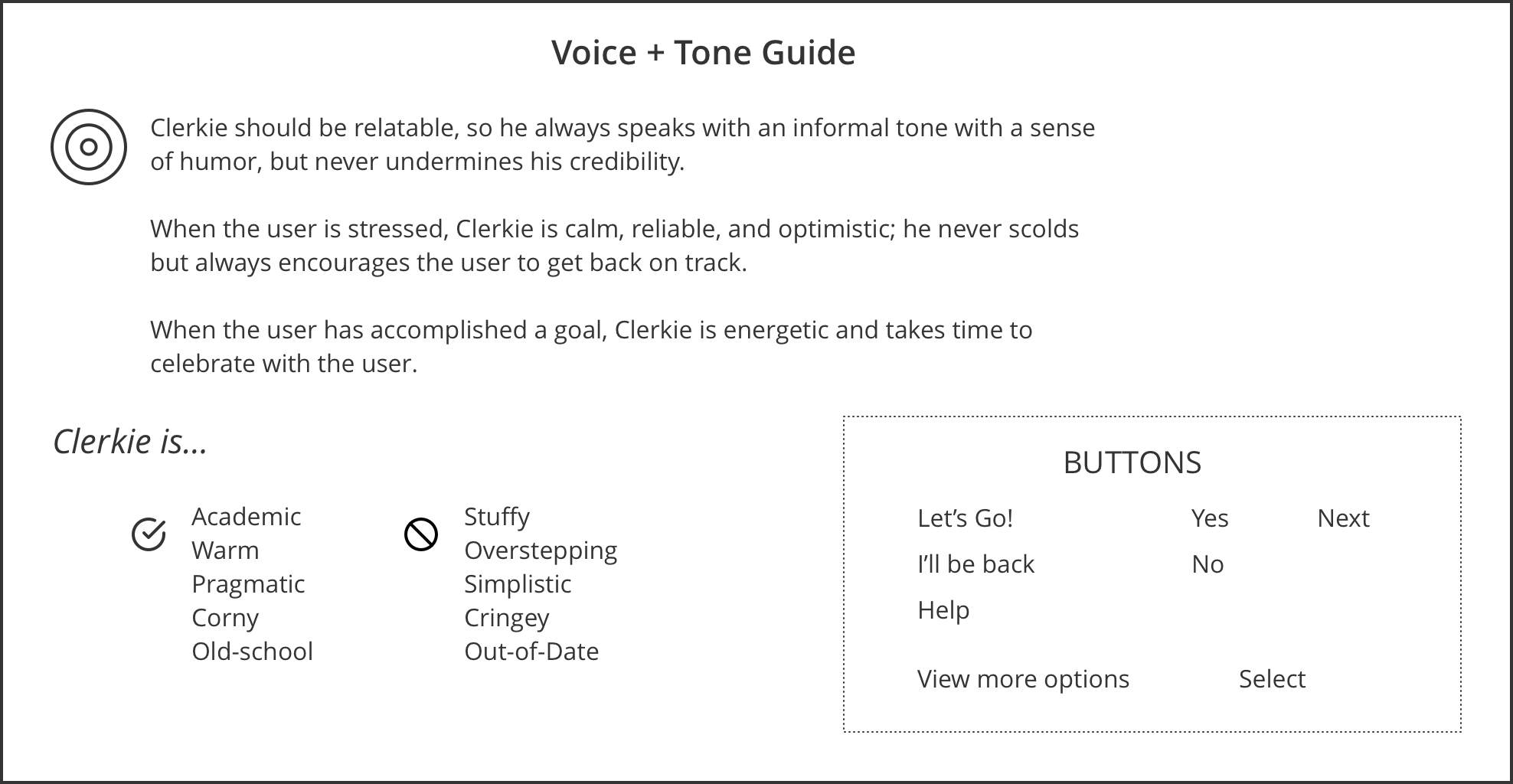
The more we explored voice and tone combinations for Clerkie, the more we realized we needed documentation and guidelines for Clerkie’s personality and interactions with the user. Getting this right would be critical to an engaging and useful in-app experience.
Outcomes
Validation Testing & iterations
To validate our design decisions, we tested our V1 lo-fi prototype with users to assess comprehension and usability of our onboarding, budgeting, and financial product comparison flows.
Synthesis of our testing results showed us that most of our feedback was focused on the following priority areas: (1) Clerkie’s personality, (2) Trust and safety, (3) Level of detail, and (4) User Inputs. We iterated in these areas, described below.
Welcome Screens
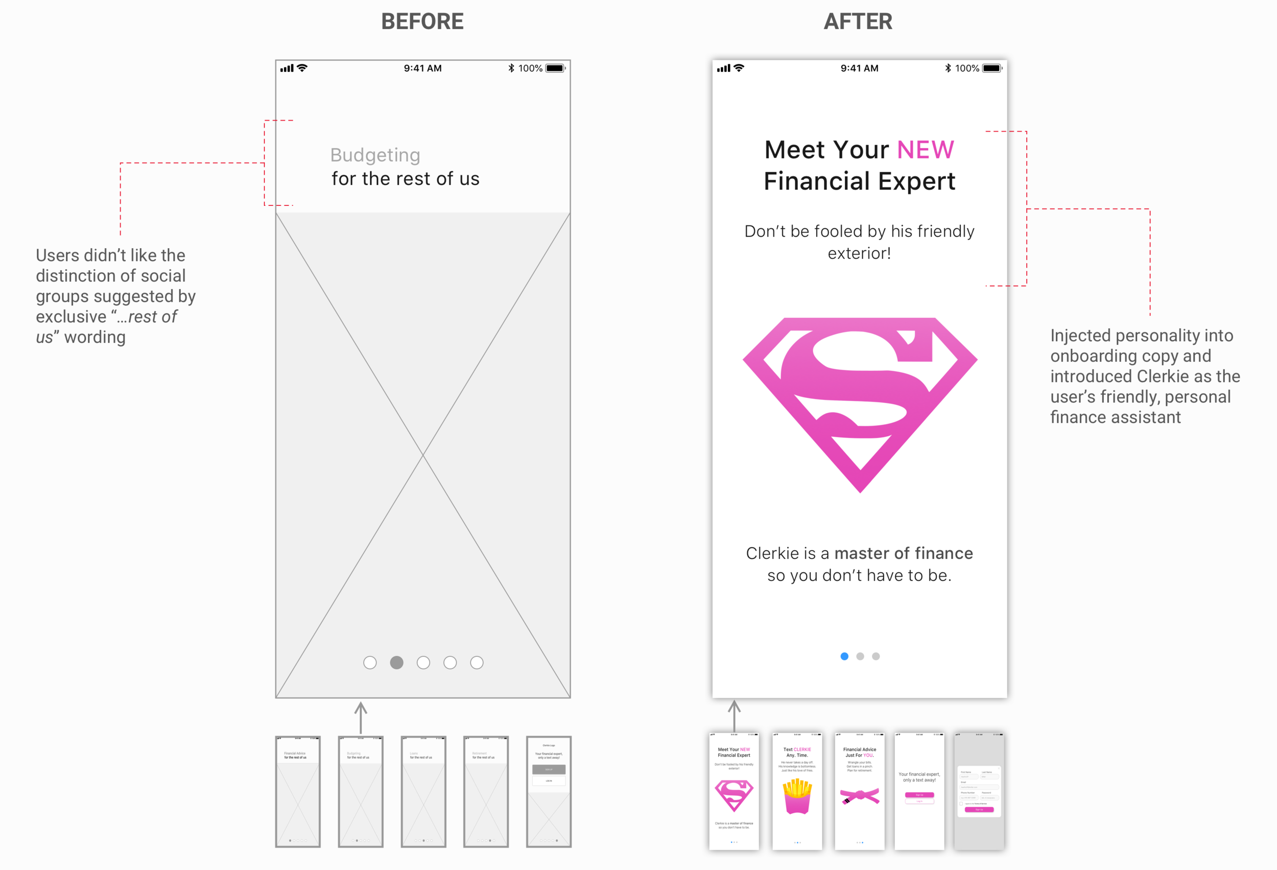
Welcome Screens are an opportunity to inspire and connect with users. Early copy felt exclusive and created artificial barriers between potential user groups. Refined content presented Clerkie as a knowledgable, non-intimadating financial assistant, accessible to all users.
Onboarding Flow
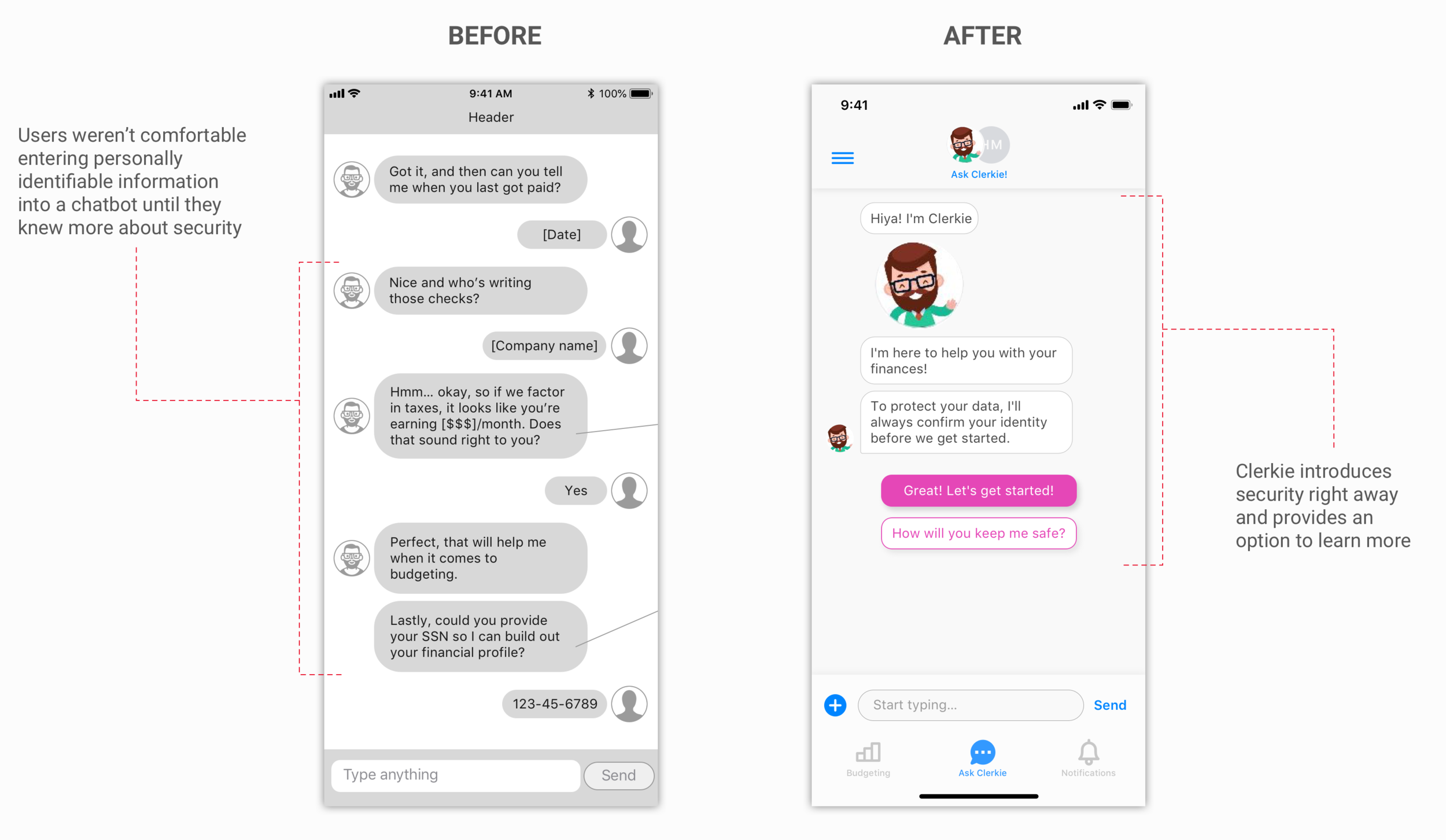
Additional explanation of security reduced ambiguity and uncertainty around submitting sensitive information in an unfamiliar format.
Onboarding Flow
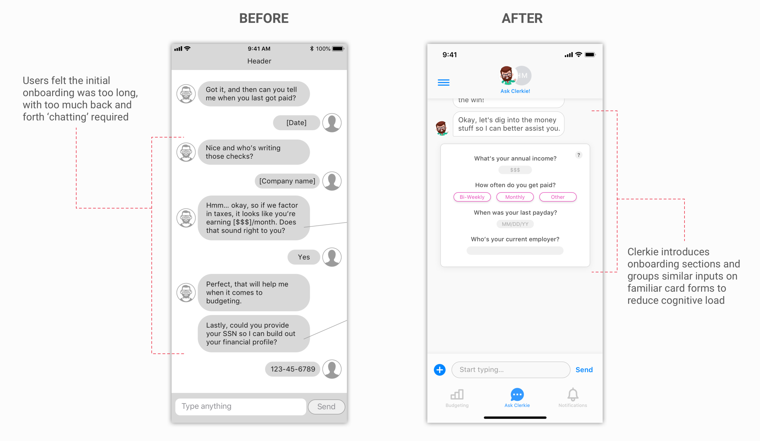
Users needed to understand why they were inputting certain information into the app and wanted to have a better sense of their purpose and progress as they moved through the onboarding flow.
Budget Onboarding
Users wanted an overview of their budget and general setup assistance to better conceptualize and organize their finances.
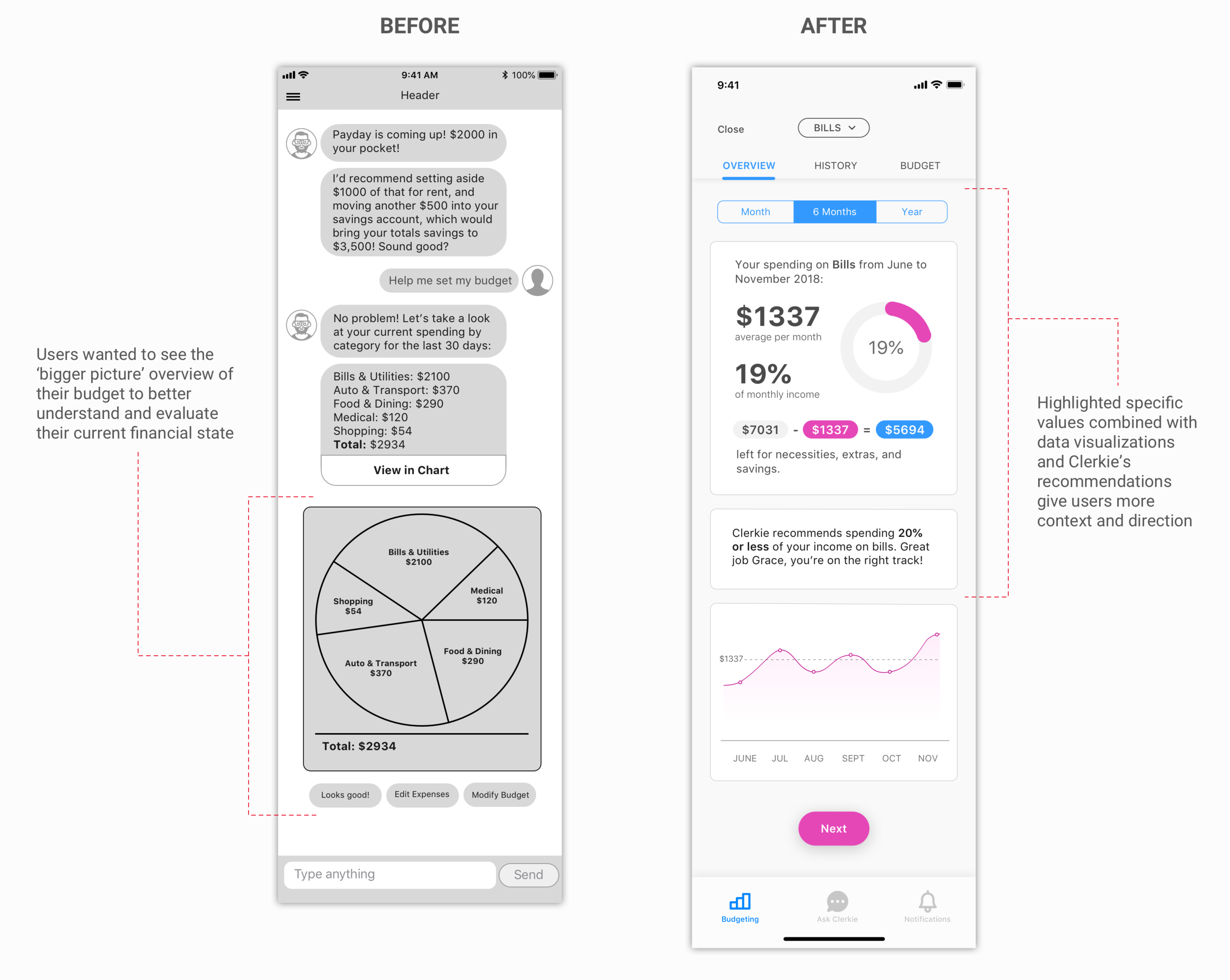
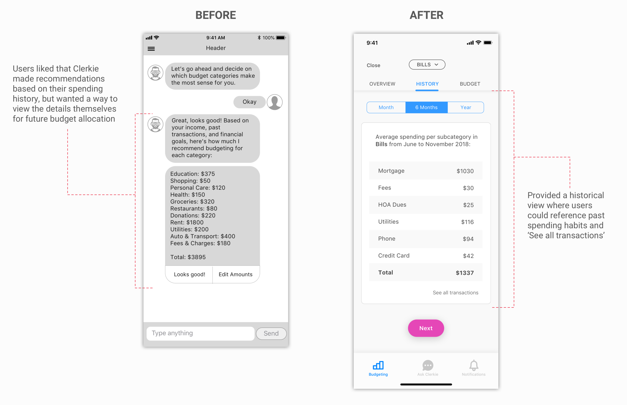
Budget History
Zooming in and zooming out. Users wanted a balance of being presented with high level trends on their spending and the option to drill down into the details to investigate transactions and learn more about their habits.
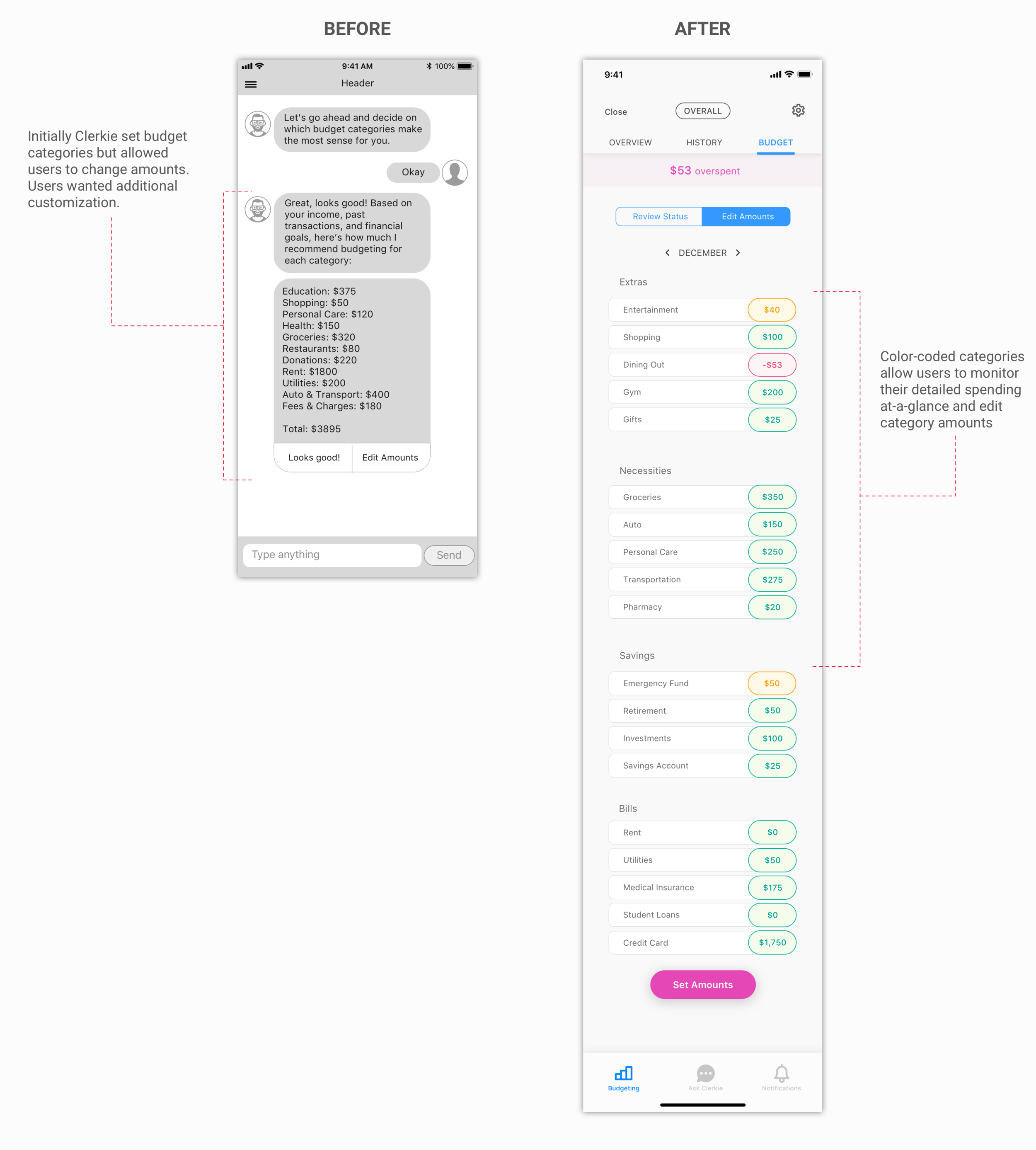
Budget Customization
Budgets are guidelines, and guidelines are meant to be flexible. The ability for users to remove or adjust budgets as their goals and needs changed was important.
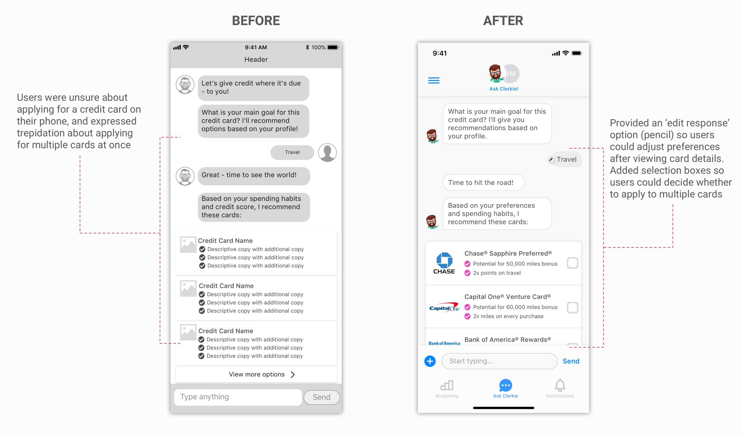
Financial product comparison
Applying for a credit card can be stressful. Users wanted more control during this process, including the ability to examine specific card details and compare cards against one another.
In Closing
Next Steps
In addition to our designs, the team also delivered a series of recommendations to Clerkie, including UI and security adjustments—easy fixes we felt could have an outsized impact on trust-building and continued need-finding with the current user base.
reflection
Leading a team of designers while collaborating with a founder whose opinion often diverged from the team’s design decisions was a great opportunity to improve my ability to communicate effectively with stakeholders, manage the expectations of the client, and delegate design work.

