Overview
about brazen
Brazen is a mobile healthcare app with a mission to help users make positive behavior changes in order to improve symptoms associated with their menstrual cycle through personalized recommendations. Brazen approached us to design core user flows for their onboarding, symptoms tracking, and progress review.
my role
As a Research Lead and UX Designer, I focused on understanding the problem space and learning about our users to prioritize features for this zero-to-one build. Because the app required user inputs to generate personalized outputs, I also explored different ways to (1) encourage users to enter symptom data and (2) to deliver recommendations in a sensitive, useful way.
Research
Competitive and comparative analysis
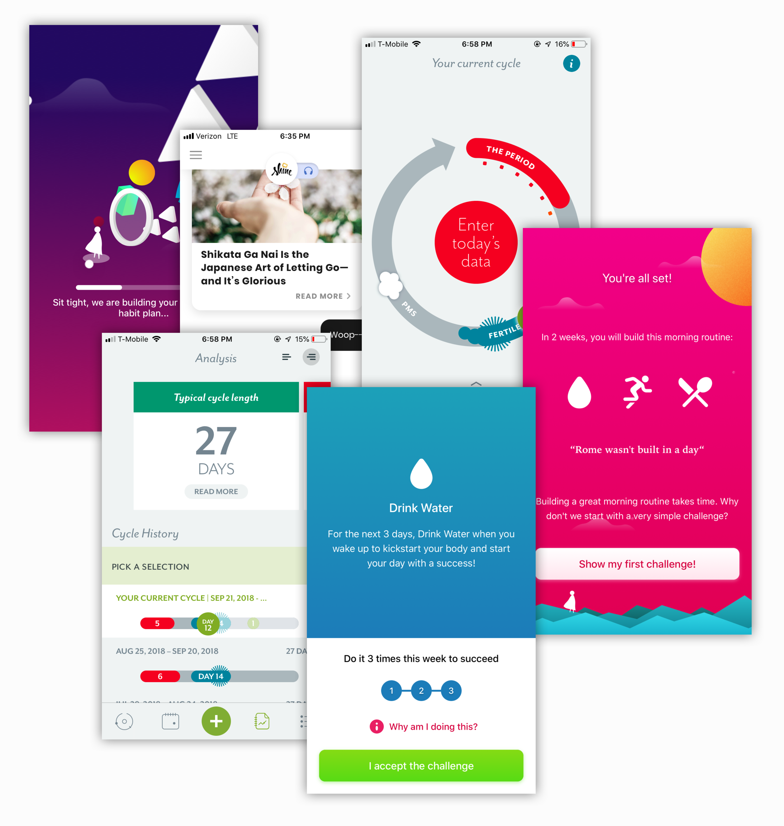
I led a team in competitive and comparative analyses to better understand period tracking and behavior change solutions, assess competitors in the space, and shape product strategy for Brazen.
Our research uncovered competitors with a high touch, personalized approach to behavior change that involved regular motivation and encouragement. In contrast to current apps, we saw an opportunity to introduce increased functionality for the exploration of personal data and the science behind behavior change.
Armed with an increased understanding of market offerings, we investigated potential user needs.
user surveys
The team explored existing client materials related to menstrual health and behavior change. After synthesizing our learnings, we developed a set of survey questions and sent them to 14 users who fit the client’s target profile in order to achieve the following goals:
Better understand user pain points related to fitness, general health, and period tracking;
Discover what users liked, disliked, and desired from their current apps;
Discover current solutions for physical PMS symptoms not related to apps
We found that:
11 out of 14 Respondents reported having used a health or fitness app to make lifestyle changes
14 out of 19 Applications mentioned included features related to sleep, fitness, or period tracking
11 out of 14 Respondents reported the severity of their menstrual symptoms as moderate to intense
9 out of 14 Respondents reported using sleep, hydration, or food to manage their symptoms
Research Synthesis
Behavior Prioritization
By synthesizing both the client’s research and our own survey data, we identified three main categories with the largest potential for positive impact on users’ symptoms: (1) sleep, (2) nutrition, and (3) mood awareness.
Core User Needs
From our competitive and comparative research as well as user survey data, we created a set of potential features and affinity mapped them. Then we took our refined set of features and placed them on two separate 2x2 frameworks to identify those features which were most important to users, most important to business, and easiest to implement.
Design
task flows
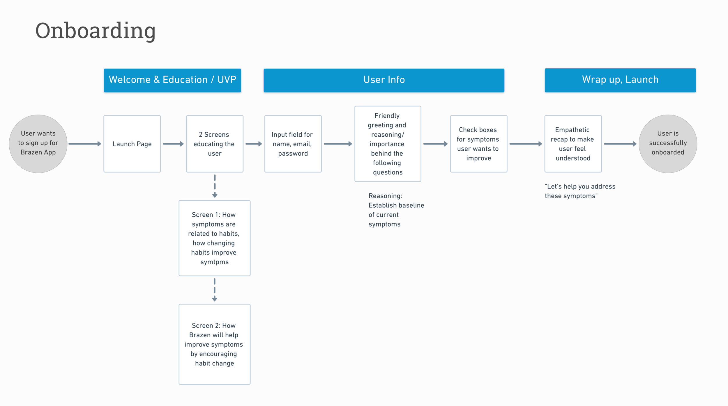
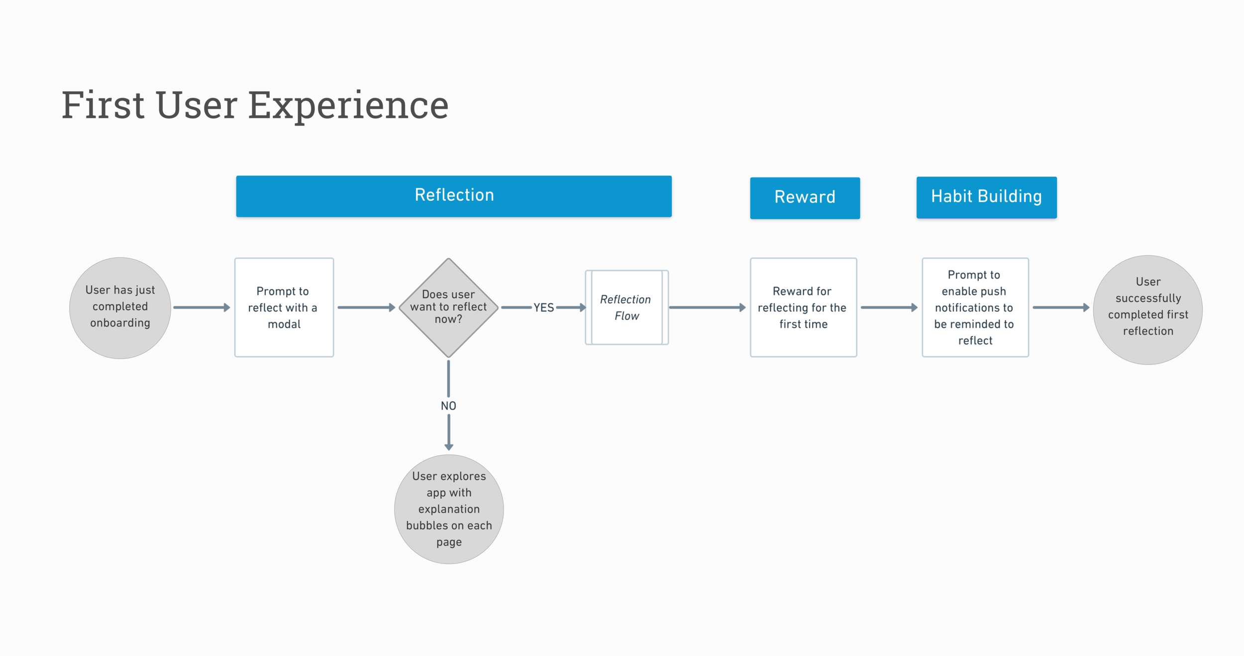
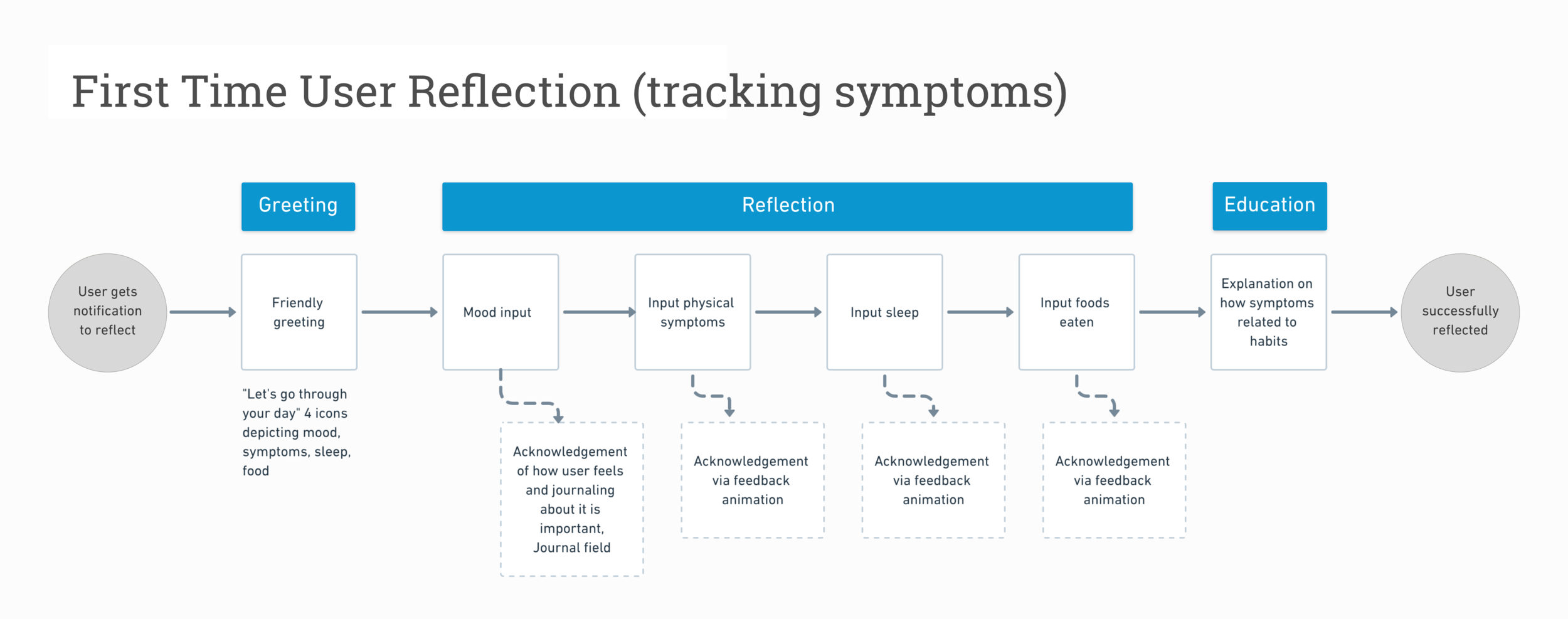
With our research and user needs a a foundation, we began exploring design for the critical actions we wanted users to be able to take in Brazen’s MVP, including completing Onboarding, the First User Experience, and a First User Reflection (tracking symptoms).
We started by building task flows. After feedback from a Senior Designer, we updated each with consideration for edge cases. We also added explanations of value for the user at specific states where relevant.
UI Sketching
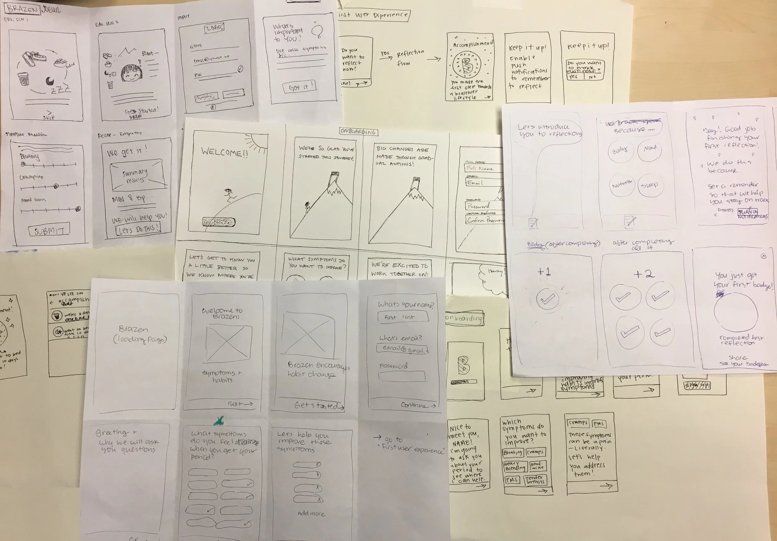
Armed with our task flows, the team began to ideate on the UI of each screen using pen and paper and a shared whiteboard. After individually generating a lot of potential ideas, we came together as a group and dot voted in order to converge on a user flow.
wireframes
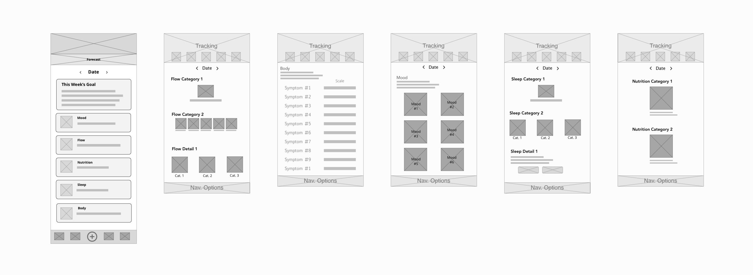
We transformed our hand-drawn sketches into low fidelity wireframes to represent our ideas with consistent structure and style. We delivered wireframes to the client for a round of feedback and came away with some updates to make, along with new screens to add (Calendar, Metrics Page). Example wireframes from Reflection (Tracking) User-flow below.
*a note on branding
At this point, we collaborated with the client’s Branding team to land on a visual ‘North Star’ and system for creating consistent, on-brand mockups. They wanted to move forward with their current, very ‘brazen’ visual language. Based on our own research and testing, we recommended against it. Nevertheless, they were insistent to move forward.
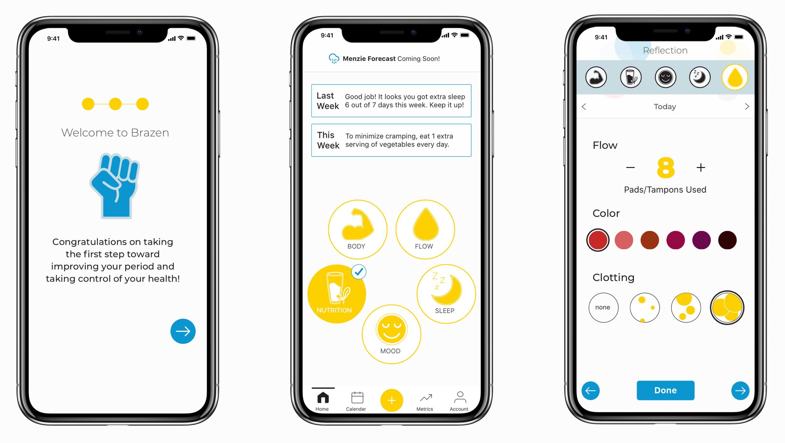
Example High Fidelity Screens
Once we had validated our low fidelity wireframes through client feedback and reviews with in-house senior designers, we agreed to create example screens of core functions using the client’s branding. Due to time constraints, we weren’t able to develop a new brand identity for the app, but advised Brazen to reevaluate their visual language for future iterations.
In Closing
next steps
reflection
Validation testing confirmed that users were able to move through task flows intuitively, and understood where to enter information. But it also uncovered broader questions about the underlying science—testers wanted to know more about how certain behaviors would improve their cycle. This will be addressed in the next iteration’s extended and more scientific onboarding.
Designing for Brazen was a great opportunity to determine how to balance asking users for specific, personal information while providing them assurance that their data would be used only in a way that benefitted their health and wellbeing. This required deep empathy for the user and collaboration with the client to make sure each design decision was as intentional as possible.

